Naruko Tenjinsha Shrine
Logos, Visual Identity
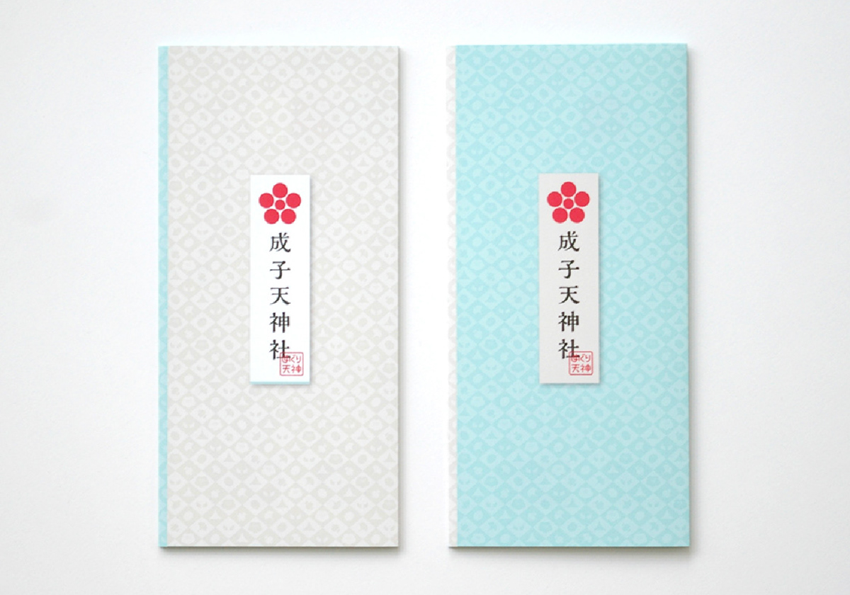
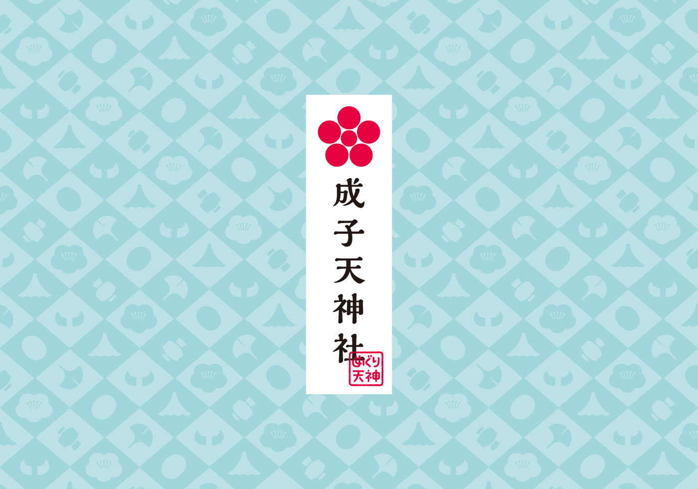
A shrine with a history of over 1,000 years in the heart of Tokyo, Nishi-Shinjuku, and surrounded by skyscrapers. Not only is the god Tenjin enshrined there, but also there are other highlights, such as a sacred mound, the Seven Deities of Good Luck, a statute of the messenger to the god, and many more on its grounds. We arranged them in a certain order, as if a pilgrimage to a place named, “Meguri-Tenjin”, that visitors can tour from spot to spot. I chose ecru, plum-red, and pale blue as the fundamental theme colors for the design. Ecru represents: to tour gods with pure hearts. Plum-red depicts the god of Tenjin, a god of study. Clear pale blue was chosen for “feeling invisible power”. Furthermore, by iconizing the highlights and using them as graphic patterns for leaflets, stationary, and the web, it implies that there are many gods to visit in the grounds of Meguri-Tenjin.
Client: Naruko Tenjinsha Shrine
Planning / Direction: EAST JAPAN MARKETING & COMMUNICATIONS, INC.
Copywriting: Hidekazu Kobayashi
Art Direction: Shunpei Yokoyama Design Office
Planning / Direction: EAST JAPAN MARKETING & COMMUNICATIONS, INC.
Copywriting: Hidekazu Kobayashi
Art Direction: Shunpei Yokoyama Design Office